INTRODUCTION | RESEARCH | EMPATHIZE | DESIGN | TESTING | REFLECTION
Travel should feel exciting, not overwhelming. American Odyssey brings clarity to U.S. trip planning by turning scattered information into curated guidance, personalized suggestions, and a seamless planning experience.
Toolkit: Figma, FigJam, Adobe CC, ChatGPT | Role: UX Researcher, UX/UI designer | Timeline: 5 Weeks
INTRODUCTION
The Purpose
American Odyssey aims to make exploring the United States simple, inspiring, and deeply personal by giving travelers a curated home for discovering destinations, planning trips, and uncovering meaningful experiences. The platform blends beautifully crafted guides, interactive maps, and an AI travel companion to help users find the best of every state, city, and region while building trips that feel uniquely their own.
The Challenge
The idea for American Odyssey surfaced after recognizing how overwhelming and fragmented U.S. trip planning has become. Travelers bounce between dozens of sources, from blogs to review sites to scattered map tools, often piecing together mismatched information that lacks context or personalization. Even seasoned travelers struggle to find trustworthy recommendations, while beginners don’t know where to start. In a country with endless options, most tools either drown users in noise or offer bare-bones itinerary builders that lack inspiration.
How might we help travelers plan and explore U.S. destinations with clarity, inspiration, and confidence, all in one place?
The Objective
Design a mobile app that helps travelers explore U.S. destinations with curated guides, interactive maps, and personalized trip planning tools.
Create a seamless digital experience that supports travelers in the moment, reducing research overload and minimizing the need to switch between multiple apps during the planning and exploration process.
RESEARCH
Current travel-planning pain points
According to McKinsey and Company, domestic travel continues to dominate in the Americas, with domestic trips accounting for most travel spending and lodging nights expected to reach 19 billion annually by 2030. With this growth comes greater pressure on travelers to sift through crowded platforms and scattered resources. I wanted to understand how people currently navigate U.S. trip planning and where the biggest points of friction appear.
Research Goals
To clarify these challenges, I focused on understanding both traveler behavior and the tools they rely on. My goals were to:
Understand how travelers plan U.S. trips and what motivates their destination choices
Identify key frustrations users experience when researching, organizing, and customizing domestic travel
Determine which exploration and discovery features matter most when choosing activities, guides, or cities
Analyze current resources and feature offerings from major travel planning competitors
Validate the need for a curated, all in one U.S. travel platform supported by personalized insights and AI assistance
Competitive Analysis
With these goals in mind, I examined platforms like Tripadvisor, Google Travel, and Roadtrippers to understand how they support planning and where they fall short. Each competitor offers helpful pieces of the experience such as reviews, search, curated guides, or road trip features, yet none deliver a unified or AI driven way to personalize a full U.S. trip from beginning to end. This gap in intelligent assistance, alongside fragmented and often overwhelming interfaces, directly shaped the direction of American Odyssey.

Key Findings
A clear pattern emerged. Most travel apps are cluttered with crowdsourced noise, overly utilitarian, or too narrow in scope. This creates an opportunity for a focused platform that brings curated inspiration, streamlined planning tools, and contextual AI support into one cohesive experience. American Odyssey fills that gap through clean curation, an intuitive exploration map, and a helpful AI assistant that makes planning more enjoyable, more intentional, and more personalized than anything offered by current competitors.
EMPATHIZE
Interview Results
These interviews revealed how fragmented and overwhelming U.S. trip planning can be, and how differently travelers approach building their ideal experience. These insights helped me shift from abstract assumptions to a clearer picture of real user needs, motivations, and frustrations. From there, I translated what I learned into concrete visual frameworks that allowed me to empathize with travelers and begin defining what American Odyssey should become.
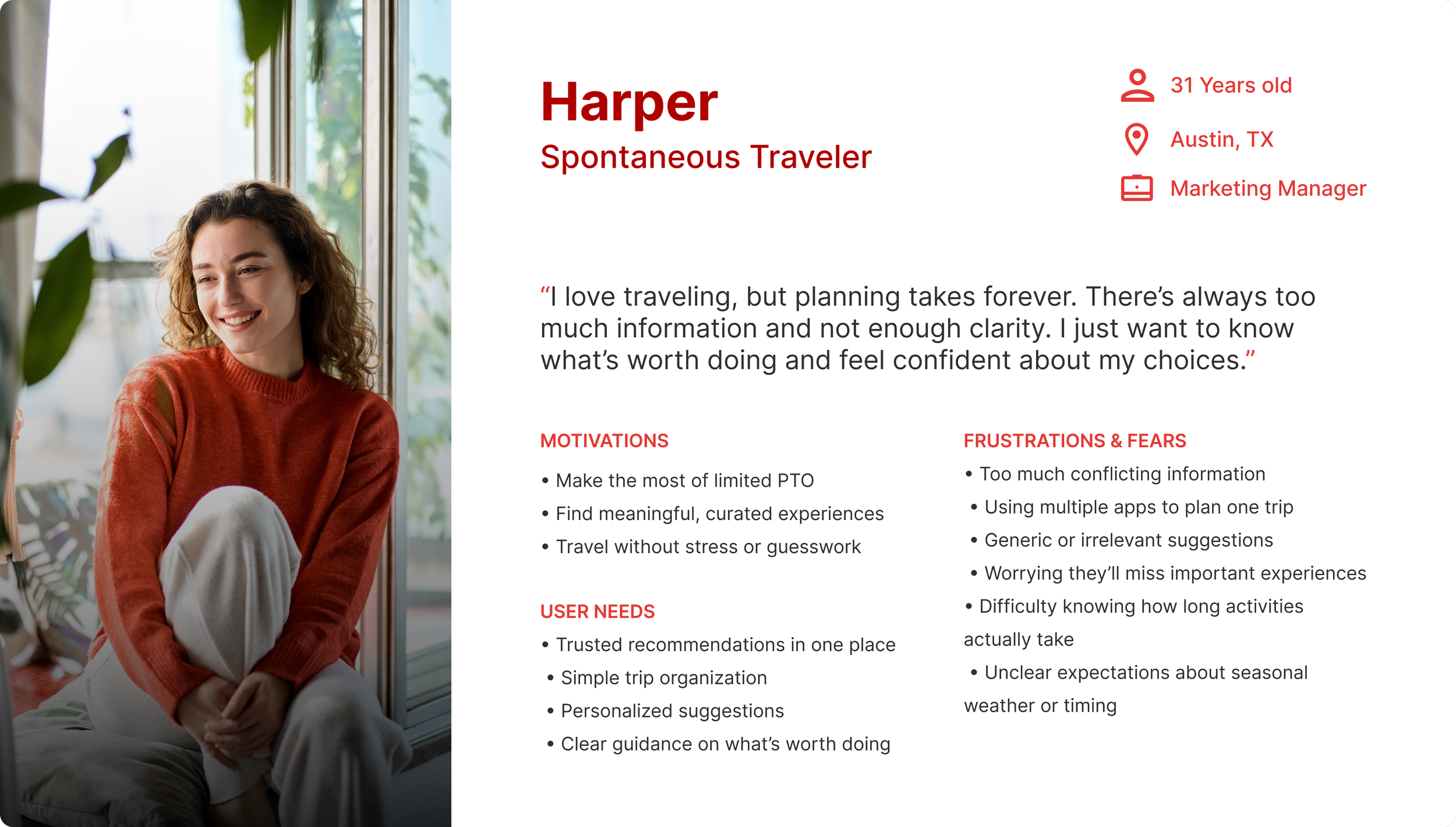
Primary Persona
Based on patterns from my user interviews and competitive insights, I created a single primary persona that reflects the core traveler American Odyssey is designed to support. While people plan trips in different ways, the most consistent needs came from travelers who feel overwhelmed by scattered information and want a simpler, more curated approach to planning U.S. trips. Because American Odyssey aims to make travel planning clearer, more enjoyable, and less fragmented, this persona became the central focus for shaping the product’s features and experience.
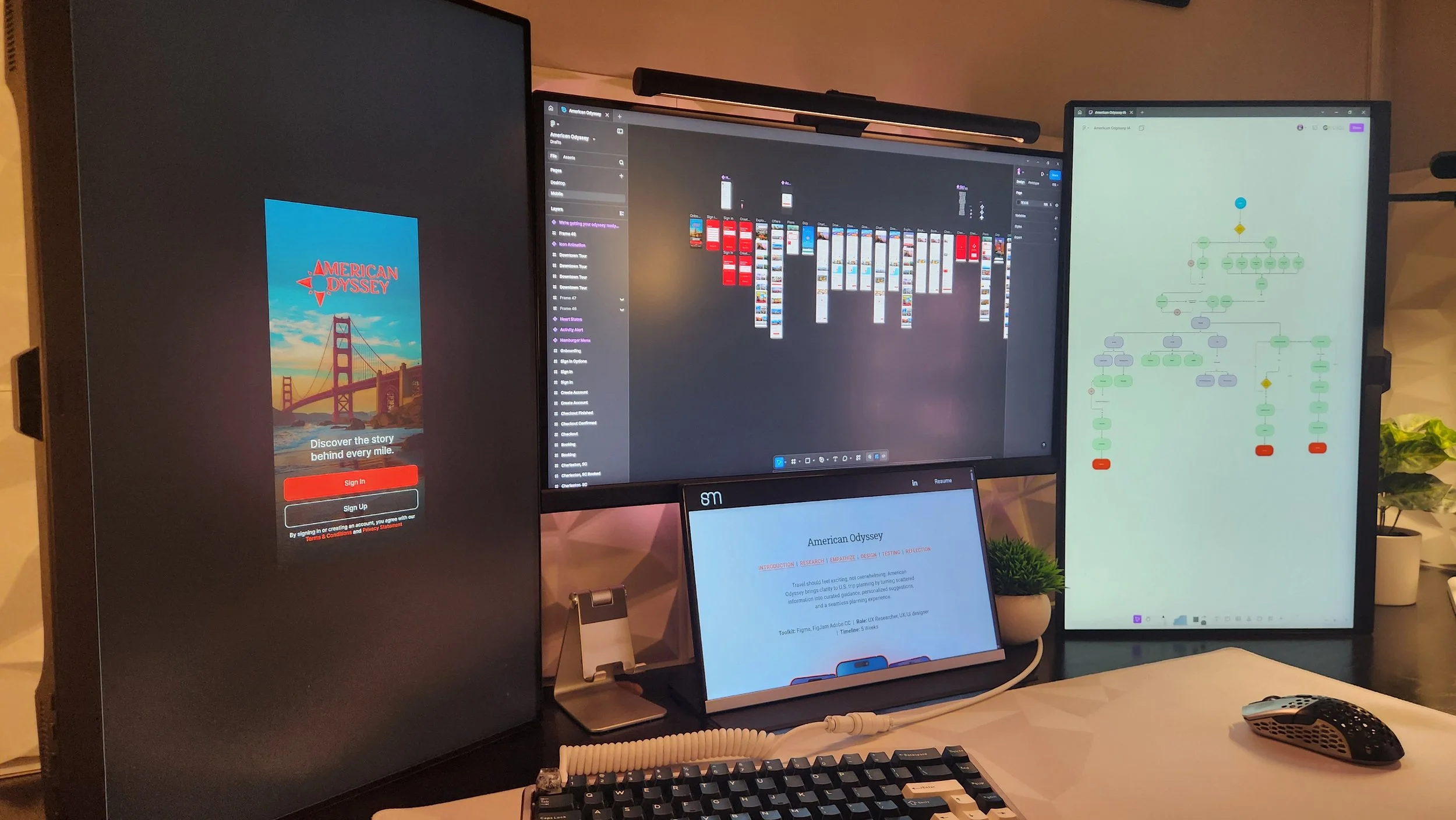
Determining the User Flow
After gathering the research and seeing where people were getting stuck, I needed a structure that made the whole experience feel easier to navigate. The information architecture became the first step in shaping that. I organized the trips, activities, and offers in a way that matches how travelers naturally plan: start broad, explore what interests them, and move forward without confusion. This layout set the foundation for everything that came later, making sure the product feels intuitive from the moment someone lands on the Explore page.
Interviewing Users on U.S. Travel Planning
To better understand how people actually plan their trips, I spoke with five travelers through phone calls and video interviews. The goal was to unpack the real process behind choosing destinations, building itineraries, and discovering things to do across the U.S.
These conversations helped reveal which tools travelers rely on, where they feel the most friction, and what ultimately prevents them from planning the kind of trips they want.
Travel planning feels scattered.
Users move between countless tabs, guides, blogs, and apps. The process feels disorganized and mentally draining instead of exciting.
Personalized recommendations keep things clear.
Users want suggestions aligned with their budget, travel style, and timeframe. Generic lists don’t help them make decisions.
Too many apps ruin the flow
Trip planning often spans 5 or more platforms, causing lost details and a fragmented experience. One cohesive tool fixes that.
Trip organization is a major pain point.
Even experienced travelers struggle to keep activities, notes, bookings, and ideas in one place. Many rely on messy Google Docs or scattered screenshots.
People want trusted curation, not endless options.
Interviewees said they often feel paralyzed by the volume of search results and conflicting recommendations. They want fewer, better options.
AI can simplify decision-making.
Users want fast, personalized answers about packing, timing, and activities. They need an assistant that speeds up planning.
DESIGN
Brand Identity
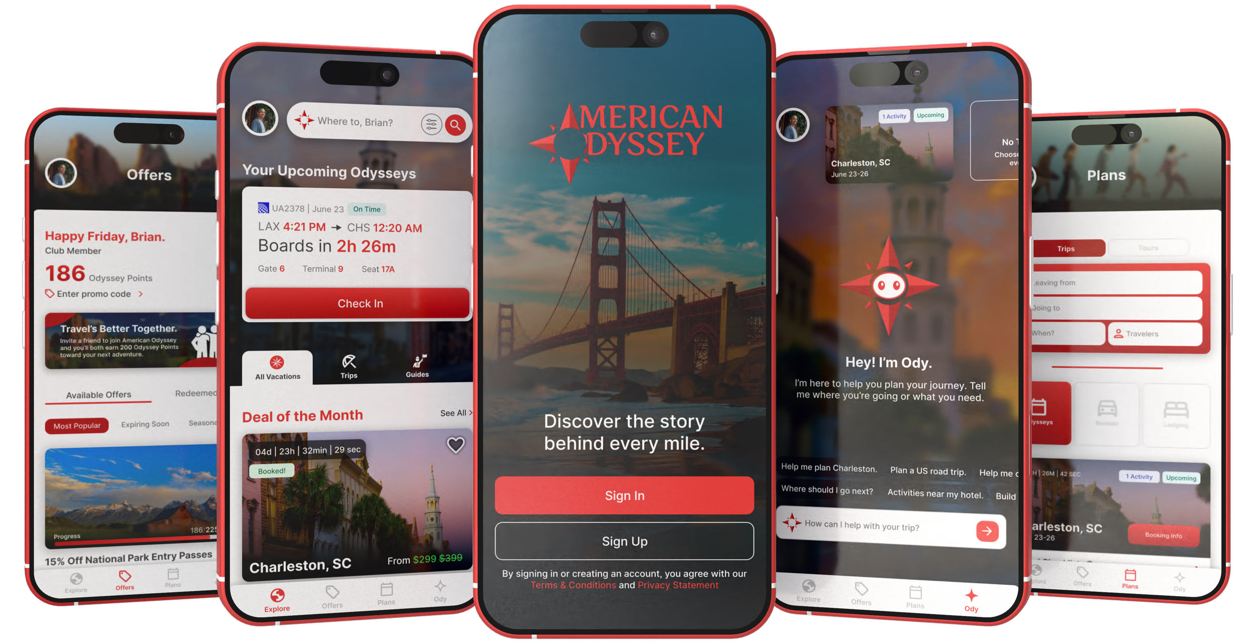
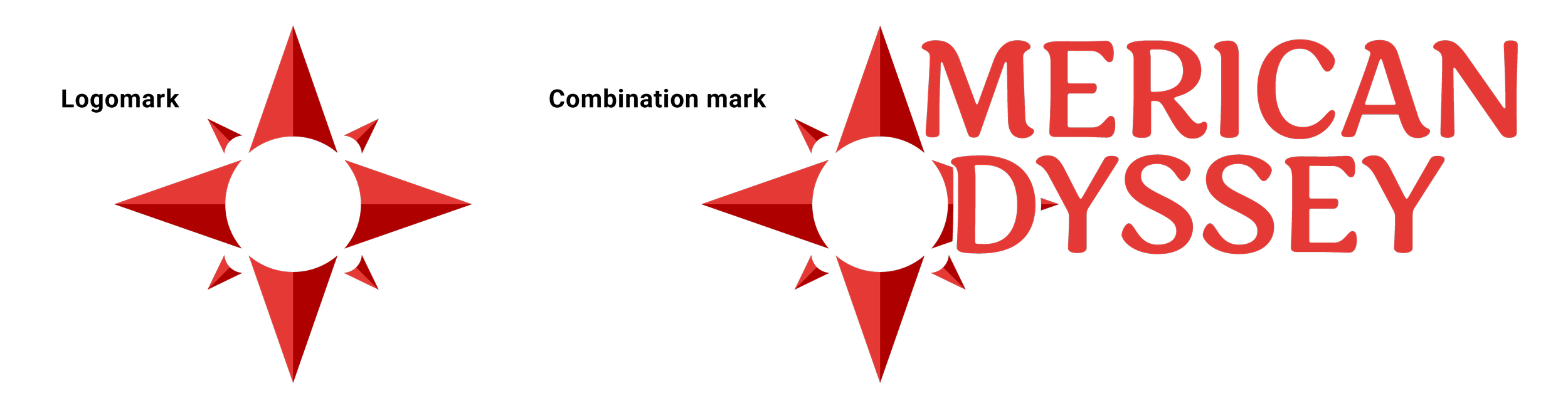
For American Odyssey, I explored several directions that could capture the spirit of travel, discovery, and uniquely American landscapes. Early concepts ranged from abstract map markers to stylized path lines, but the solution became clear once I focused on the idea of guidance and exploration.
The final mark centers around a custom compass emblem. It merges the A from American and the O from Odyssey into a single, unified form, symbolizing the brand’s promise to guide travelers wherever their journey leads. The compass conveys orientation, confidence, and forward movement, while the typography reinforces a sense of heritage and story.
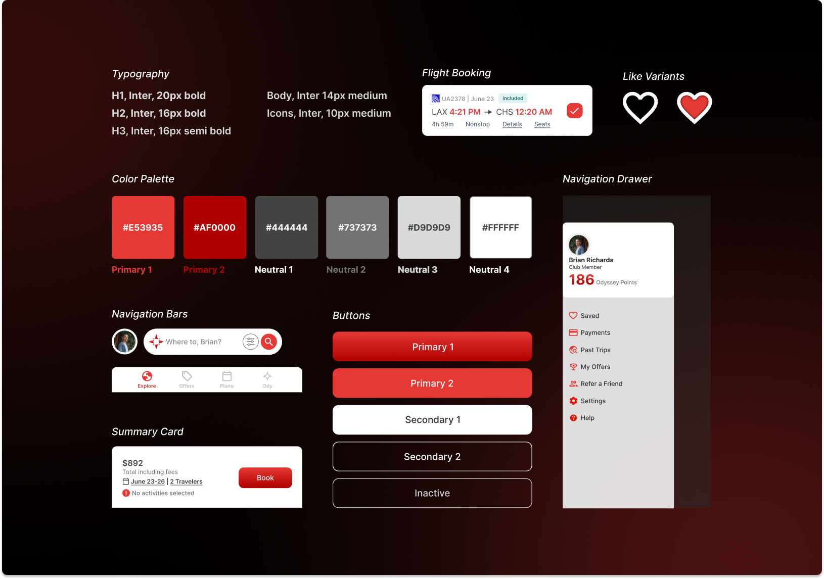
UI Component Library
To support American Odyssey’s brand vision, I developed a unified component library that translates the identity into a flexible, scalable UI system. The goal was to create an interface that feels confident, warm, and intuitive while maintaining the clarity travelers need as they plan their journeys.
The foundation begins with a restrained color palette: deep red primaries drawn from the brand’s compass mark paired with a range of neutral grays. This neutrality was intentional. Because American Odyssey relies heavily on rich destination photography, the UI needed to stay out of the way and let the imagery carry the emotional weight. The neutrals ground the interface without competing for attention, while the red accents appear only where action or guidance is needed, reinforcing the brand’s identity with precision rather than volume.
Inter’s modern, versatile type family adds to this balance. Its readability across dense information layouts such as flight cards, pricing summaries, and navigation drawers helps maintain a clean hierarchy even when screens become content heavy.
A Quick Recap
Research showed that travel planning feels scattered and overwhelming for most users. People jump between blogs, review sites, map tools, booking pages, and personal notes, which makes even simple trips feel chaotic. Many rely on messy Google Docs, screenshots, or long lists just to keep track of dates, activities, and ideas. Interviewees also said they struggle with generic recommendations, too many options, and conflicting information, which makes decision making harder instead of easier. Overall, travelers wanted clarity, trusted curation, and a way to plan without juggling multiple platforms.
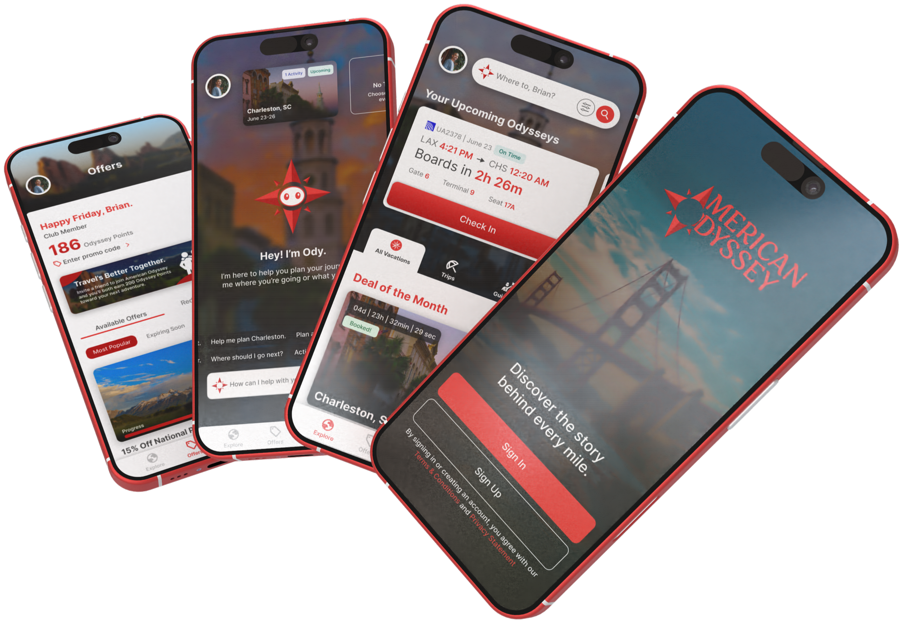
How American Odyssey Fixes These Problems
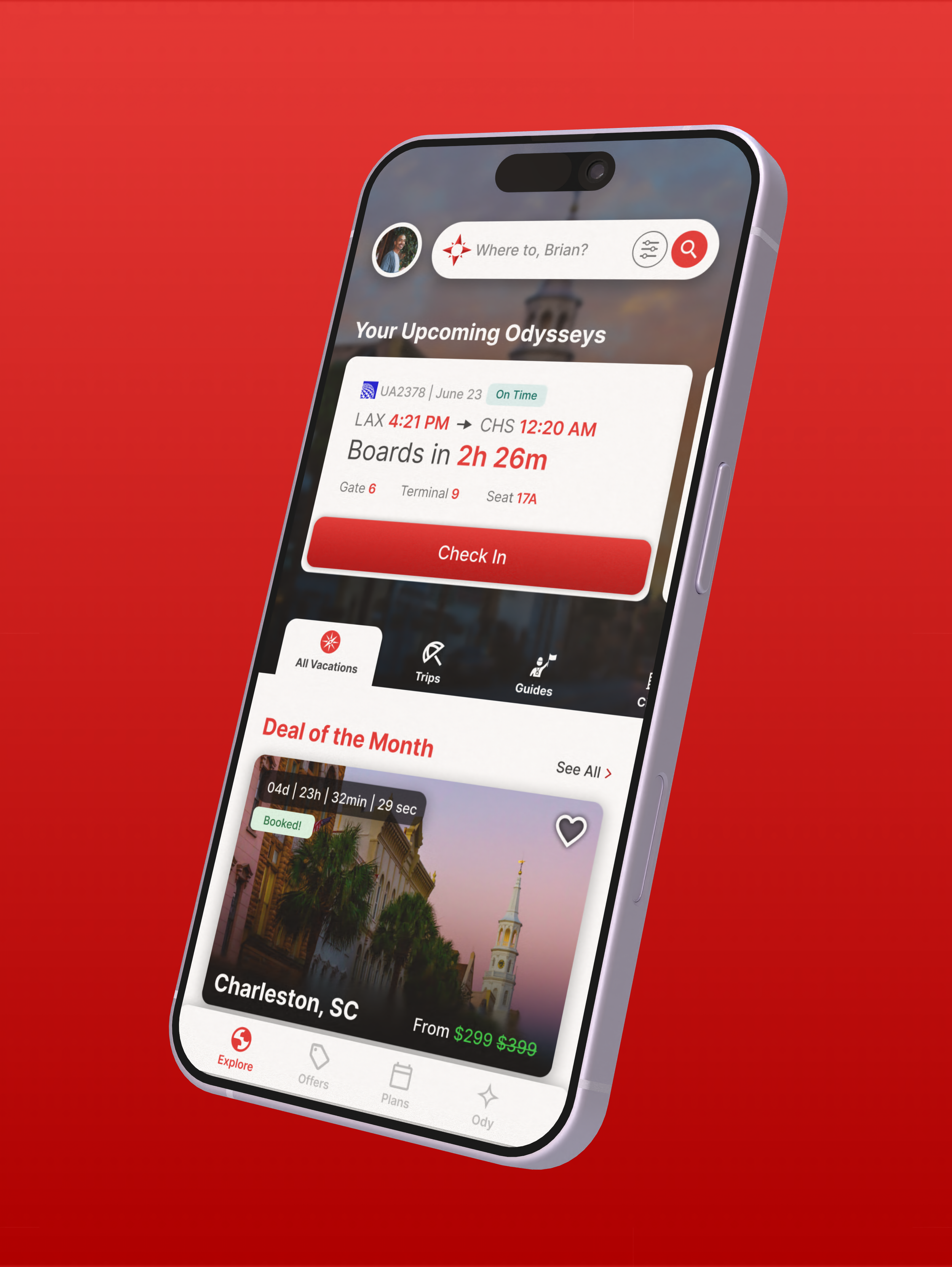
American Odyssey brings discovery, planning, and inspiration into one place, replacing the fragmented process with a clear and unified flow. The Explore feed surfaces curated destinations, seasonal picks, and trusted guides, giving users high quality inspiration without the noise of crowdsourced lists. The Plans tab keeps dates, travelers, activities, and trip details organized in a single view so nothing is lost. To reduce decision fatigue, the platform uses simple navigation and clean curation that guide users instead of overwhelming them. And when travelers feel stuck, Ody, the AI assistant, provides fast, personalized answers that can cut hours of research down to a few seconds. Together, these features turn a chaotic multi-app process into a calm, cohesive, and confident travel planning experience.
TESTING
Usability Testing
To test my high fidelity prototype’s core features, I conducted a round of usability testing using 5 participants. This round of testing was conducted in person and notes were taken to review afterwards.
Test Findings
Key Wins
Positive reception to Ody as the AI agent
Strong appreciation for the ability to book flights and lodging together
Users valued having optional activities included in the booking flow
Pain Points
Need for a prompt showing how many activities have been added to the current trip booking
Lack of a confirmation option when booking without any activities
Ody’s character design was perceived as off-putting by multiple users and needs an update
Odyssey pricing displayed in the brand’s vibrant red carried a negative connotation
Users wanted the ability to swipe through multiple images for each trip listing
Testing Takeaways
This round of testing was incredibly helpful. The feedback gave real insight into how people actually used the app, and many of their suggestions were carried straight into the final prototype. The result is a design that feels more intuitive, more refined, and more grounded in real user needs.
REFLECTION
What’s Next?
The next step for American Odyssey is to refine and introduce features based off a second round of testing to create a more seamless, intelligent travel experience, ultimately positioning it as a truly comprehensive planning companion.
Key takeaways
There’s a lot to weigh when building a product. What features actually matter? What delivers the most value to the people using it? How do you shape something that stands out in a crowded space? These questions anchored every decision I made while creating American Odyssey. The process was genuinely enjoyable, and it pushed me to grow as a designer in ways I didn’t expect.
Here are my 3 key takeaways from this project:
Plan out the project thoroughly. Rushing into visuals without a clear plan and solid research leads to shallow work. Taking the time to understand the problem, map the flow, and validate decisions is what separates simple UI execution from true UX design.
Take inspiration from the competition. Studying competing products isn’t copying. It’s understanding the landscape, seeing what already works, and identifying where the gaps are. Pulling inspiration from strong patterns can spark smarter ideas and ultimately help you design a solution that stands out rather than blends in.
You can’t force good ideas. When I hit moments of burnout during this project, stepping away for even a short time made all the difference. Coming back with a clear mind opened the door to new angles, better solutions, and ideas I never would have reached by pushing through.
American Odyssey pushed me to think beyond screens and consider the full experience of planning a trip. It strengthened my process, sharpened my instincts, and reminded me why I love designing products that make life a little easier.
Thank you for viewing my work. Shown below are a few of my other projects.
UI/UX CASE STUDIES
Each case study breaks down the problem, research, design decisions, and outcomes behind the final product.