INTRODUCTION | RESEARCH | EMPATHIZE | DESIGN | TESTING | REFLECTION
Data means little without context. Playform turns raw sports performance into clear, visual stories that help fans and analysts understand the game beyond the box score.
Toolkit: Lovable, Figma, FigJam, Adobe CC, ChatGPT | Role: UX Researcher, UX/UI designer | Timeline: 3 Weeks
INTRODUCTION
The Purpose
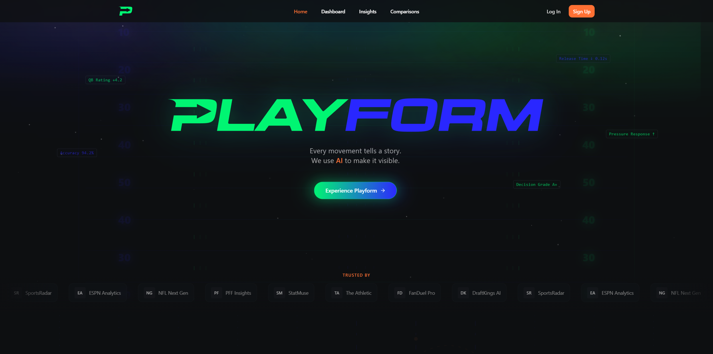
Playform is an AI-powered sports analytics platform that turns raw performance data into clear, visual stories that help fans and analysts understand the game beyond the box score. By combining advanced motion analysis, trend tracking, and intuitive visualizations, Playform makes complex data approachable and engaging for sports enthusiasts who crave meaning behind the numbers.
The Challenge
Today’s sports data landscape is fragmented, overwhelming, and often inaccessible to fans who want more than surface-level stats. Traditional analytics tools bury insights in spreadsheets or complex UI, leaving casual fans and content creators unable to quickly interpret trends, player impact, or game moments. Even advanced dashboards fail to contextualize performance, forcing users to interpret raw numbers without narrative support.
How might we design a platform that transforms dense sports data into intuitive, story-driven visuals that promote understanding, enjoyment, and deeper engagement?
The Objective
Bridge the gap between sports performance data and meaningful insight.
Design a visual analytics experience where fans can explore, compare, and understand player and team performance with minimal cognitive load.
Craft an AI-enhanced interface that tells data stories rather than just reporting statistics.
RESEARCH
Current Pain Points in Sports Analytics
Sports analytics have advanced rapidly, yet comprehension for the average fan remains low. Research indicates that while statistics have become more detailed, most visualizations still fail to make insights clear or accessible to non-experts, leaving many fans overwhelmed instead of informed (Perin et al., 2018). Studies also show that embedding interactive visuals within live game contexts improves understanding and engagement, yet most consumer platforms do not take advantage of this approach (Lin et al., 2022). Finally, narrative-driven visualizations have been shown to increase comprehension and retention, suggesting that fans benefit when analytics provide meaning rather than raw numbers alone (Liu et al., 2024).
Perin, C., Vuillemot, R., & Stolper, C. D. (2018). State of the art of sports data visualization. Computer Graphics Forum, 37(3), 663–686. https://doi.org/10.1111/cgf.13447
Lin, T., Yu, L., Xiong, C., & Wang, Y. (2022). The Quest for Omnioculars: Embedded Visualization for Augmenting Basketball Game Viewing Experiences. arXiv preprint arXiv:2209.00202. https://arxiv.org/abs/2209.00202
Liu, Z., Li, J., & Chen, X. (2024). Data storytelling in data visualization: Does it enhance the efficiency and effectiveness of comprehension tasks? Proceedings of the 2024 ACM CHI Conference on Human Factors in Computing Systems. https://doi.org/10.1145/3613904.3643022
Research Goals
Playform research focused on uncovering how fans and creators want to interact with performance data:
What information helps fans make sense of performance beyond raw numbers?
How can visual storytelling improve comprehension and emotional engagement?
In what ways do current tools fall short for non-expert users?
How might AI assist in translating complex datasets into digestible insights?
Competitive Analysis
With these goals in mind, I examined platforms like GameChanger, Hudl, and ESPN to understand how fans currently track player performance, compare athletes, and make sense of sports data, and where those experiences fall short.
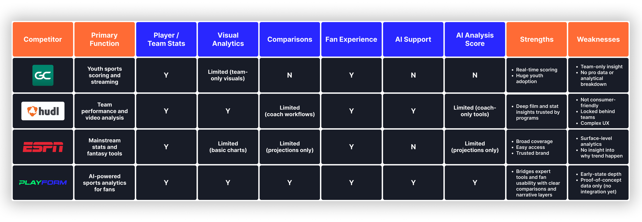
Key Findings
GameChanger, Hudl, and ESPN each solve pieces of the sports insight puzzle. GameChanger brings real-time information to families, Hudl serves teams with deep tools, and ESPN delivers broad coverage to casual fans. However, none give everyday fans a clear way to understand performance or compare players fairly. Insight is either too shallow, too technical, or locked behind team access. None offer narrative context, AI support, or comparison modes built for fans. These gaps shaped Playform as a more approachable way to understand players, trends, and matchups at a glance.
EMPATHIZE
Primary Persona
Based on patterns from my preliminary research and competitive analysis, I created a primary persona that represents the core sports fan Playform is designed to serve. While fans engage with sports in different ways, the strongest needs consistently came from people who want deeper insight into player performance but feel overwhelmed by raw statistics, jargon-heavy dashboards, or fragmented data sources. Because Playform aims to simplify analytics, surface meaningful patterns, and make data feel engaging rather than intimidating, this persona became the foundation for shaping the product experience and defining which features mattered most.

Jordan Alvarez
26 | Sports Content Creator | Austin, TX
Jordan runs a small sports content channel focused on athlete analysis and storytelling. He wants fast, visual ways to explore data and uncover insights that go beyond highlight reels.
Goals:
Find clear, reliable player analytics
Compare athletes without switching between platforms
Create shareable data-driven content
Frustrations:
Data is scattered across sites and apps
Existing analytics tools are too complex
Hard to find communities that value both stats and storylines
“I don’t just want to watch the game — I want to understand it.”
Playform helps by centralizing athlete data, simplifying analytics, and turning insights into visual stories for fans and creators alike.
DESIGN
Brand Identity
I wanted Playform to feel fast, sharp, and rooted in sports culture without leaning on clichéd balls or equipment. Early sketches went too literal, so I shifted toward a direction that focused on movement and energy instead of objects.
The wordmark builds that idea into its structure. The angled cuts and forward-leaning letters create a sense of acceleration, while the arrow carved into the P represents attack, direction, and momentum. It hints at the speed of play and the instant decision-making that separates athletes.
The color palette reinforces that tone through neon green for intensity and live energy, vibrant blue for clarity and analytical confidence, and orange for strategic emphasis and big-moment moments, all grounded by a deep navy background that keeps the system bold, legible, and unmistakably sports-driven without overwhelming the interface.
#00F572
#00F572
#FF6B35
#A6A6A6
A Quick Recap
Research showed that most sports analytics tools overwhelm rather than empower fans. People rely on box scores, highlight clips, and scattered stat sites, yet still struggle to understand what is actually happening on the field. Existing tools are either packed with raw data that requires expert knowledge or built around entertainment-focused content with little insight. This forces fans to navigate multiple sources and interpret numbers on their own, increasing cognitive load.
Competitive research confirmed the same pattern. Platforms like GameChanger, Hudl, and ESPN are strong within their own spaces, but none offer everyday fans a clear, guided, or meaningful way to read performance, compare players, or understand trends in plain language. Each delivers valuable information, but either lacks depth, hides insight behind restricted access, or assumes users already understand analytics.
Overall, fans want a smarter, simpler, and more insightful path to seeing what the numbers actually mean. That gap shaped Playform’s direction as a visual, AI-supported experience built to turn performance into understanding rather than more data.
How Playform Fixes These Problems
Playform tackles these challenges by turning complex performance data into clear, visual, and fan-friendly insights. Instead of forcing users to sift through spreadsheets or dense stat tables, Playform presents every player in an intuitive interface that highlights trends, strengths, and impact at a glance. This keeps fans in a focused, confident flow whether they are scanning a game, checking a matchup, or comparing two athletes.
Rather than expecting fans to already understand analytics, Playform introduces AI that explains what the numbers actually mean. Context cards, comparison modes, and narrative summaries translate raw data into digestible, plain-language takeaways. Fans get the meaning behind the action without feeling overwhelmed or unprepared.
By combining visual analytics, AI-supported interpretation, and structured comparisons in one place, Playform removes the need to bounce between stat sites, highlight reels, and search engines to make sense of performance. The result is a smarter, simpler, and more engaging sports experience that helps fans answer the questions they care about most.
TESTING
Usability Testing
To test Platyform’s core features, I conducted a round of usability testing using 5 participants. This round of testing was conducted in person and notes were taken to review afterwards.
Test Findings
Key Wins
Users immediately valued the clean presentation of stats, noting that they could understand a player’s performance at a glance without digging through layered menus.
Participants consistently praised the position-locked comparison flow, saying it eliminated confusion and made side-by-side evaluations feel fair and intuitive..
The different comparison modes were called out as a highlight, with users appreciating that they could toggle between overall, trends, and situational views depending on context.
Many users said the short AI-powered summaries boosted confidence, helping them feel informed even when they were unfamiliar with specific metrics.
Pain Points
Users wanted more control over which leagues, teams, or players showed up first, especially when they preferred one sport over another.
Several participants noted that advanced metrics occasionally appeared without enough explanation, signaling a need for optional tooltips or definitions for deeper clarity.
Some users expressed a desire for light personalization early on, such as selecting favorite teams or positions, to ensure comparisons and insights felt relevant from day one.
Testing Takeaways
This round of testing proved essential in shaping how Playform operates. Watching users interact with the platform highlighted what felt natural, what caused hesitation, and where clarity mattered most. Their feedback directly informed layout, language, and feature decisions, resulting in a product that feels more intuitive, more focused, and better aligned with how fans actually want to explore and understand performance.
REFLECTION
What’s Next?
The next phase for Playform is to expand AI-assisted insight generation, improve onboarding to help new users understand complex metrics faster, and introduce collaborative features that allow fans to share stories and insights within the platform..
Key takeaways
Building Playform reinforced several principles about data-first product design:
Provide context, not just numbers. Fans do not need more stats. They need to understand what influences those stats and why performance changes across games, situations, and matchups.
Balance clarity with depth. In a dashboard-centered product, information must be easily digestible while still carrying high analytical value. Fans should grasp key insights at a glance without losing the richness beneath the surface.
Build for confidence, not intimidation. Fans want to explore data, not feel shut out by it. When analytics feel approachable, intuitive, and enjoyable, users stay curious, ask smarter questions, and come back hungry for more insight.
Playform encouraged me to think beyond analytics as numbers and understand how insight shapes enjoyment. It honed my ability to translate complexity into simplicity and reinforced my passion for building tools that make people feel smarter, more informed, and more connected to what they love.
Thank you for viewing my work. Shown below are a few of my other projects.
UI/UX CASE STUDIES
Each case study breaks down the problem, research, design decisions, and outcomes behind the final product.