INTRODUCTION | RESEARCH | EMPATHIZE | DESIGN | TESTING | REFLECTION
FlavorSync helps home cooks discover, save, and share recipes through a streamlined feed that blends community inspiration with clear nutrition, making everyday cooking decisions faster and more confident.
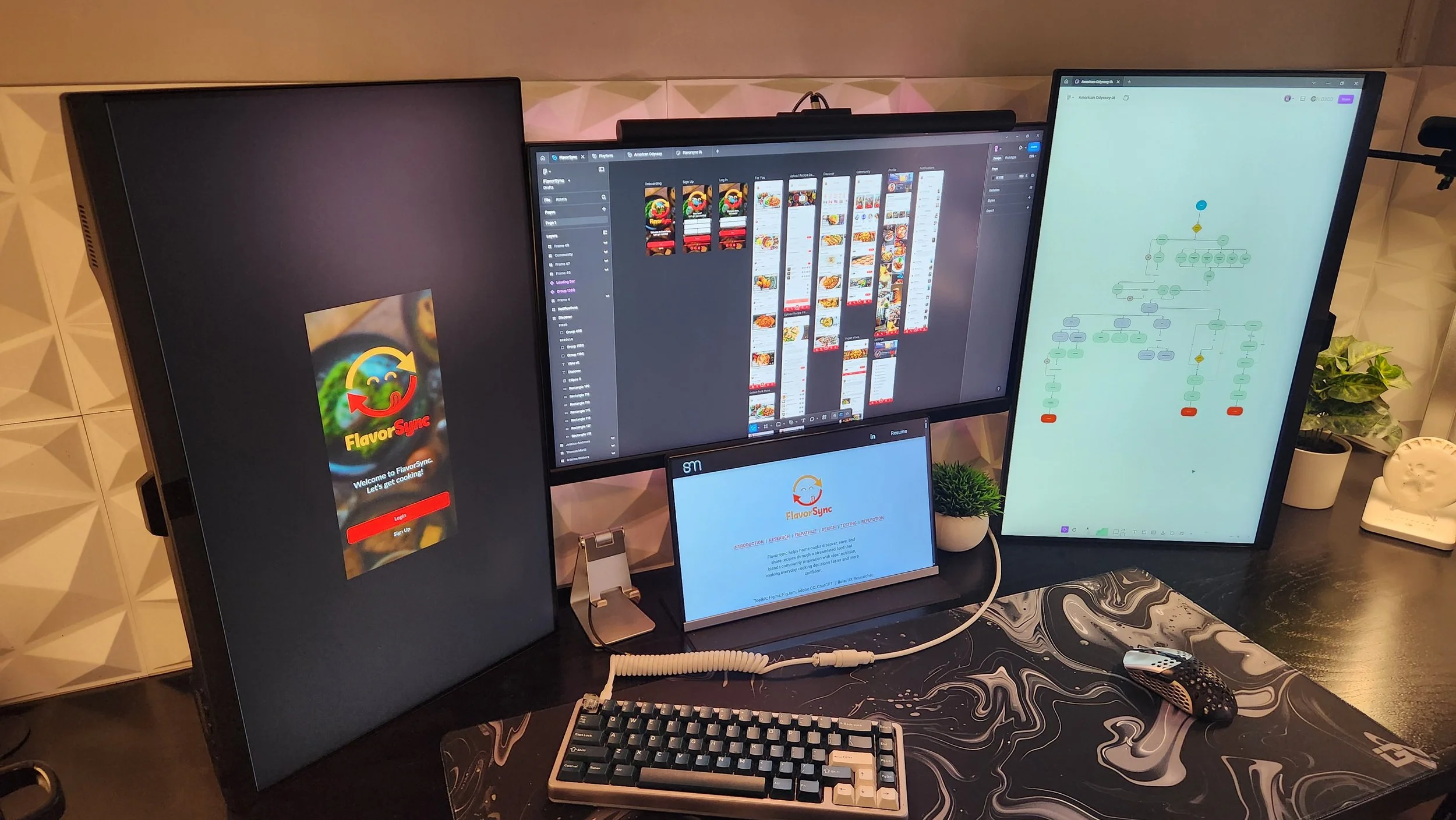
Toolkit: Figma, FigJam, Lovable, Adobe CC, ChatGPT | Role: UX Researcher, UX/UI designer | Timeline: 7 Weeks
Proof of concept only. Not representative of final functionality or implementation.
INTRODUCTION
The Purpose
FlavorSync was designed to create a friendlier, more seamless cooking experience by combining modern recipe discovery with meaningful social interaction. While existing platforms overwhelm users with ads or unstructured content, FlavorSync centers the experience around a clean, recipe-first feed and a dedicated community space where cooks can connect, share, and engage around common interests.
The Challenge
Recipe discovery today is often frustrating. Ad-heavy websites interrupt cooking flow, while social platforms emphasize entertainment over usability. Even when users find inspiration, there is little support for discussion, follow-up, or shared learning. Users want more than recipes. They want connection, guidance, and trust. The challenge was to design an experience that:
Removes friction and clutter from recipe discovery
Uses social patterns without introducing noise
Supports connection between like-minded cooks
Feels cohesive across discovery, community, and communication
How might we design a cooking app that blends feed-based discovery with community-driven interaction in a way that feels calm, useful, and welcoming?
The Objective
Design a mobile-first cooking app centered around a recipe-based “For You” feed, supported by community spaces where users can join groups, participate in discussions, attend events, and communicate directly. The experience aims to reduce friction, limit ads, and foster genuine connection between cooks.
RESEARCH
Current Pain Points in Recipe Discovery
Online recipe discovery is often frustrating because many traditional recipe sites are cluttered with ads, long narratives, and unnecessary visual interruptions that make it difficult for users to quickly find and follow the actual recipe, detracting from the core task of cooking; this cluttered experience contributes to poor usability and abandonment, while research also shows that a large majority of users do not find embedded recipe videos particularly helpful for accomplishing cooking tasks, further highlighting the inefficiencies of current discovery formats. (Karbor, 2024; Foodblog Usability, 2020)
Research Goals
Research focused on understanding both discovery and community behavior:
How users explore recipes in feed-based environments
Why ad-heavy recipe sites feel frustrating during cooking
How community interaction builds trust in shared recipes
What makes users feel comfortable participating socially
Competitive Analysis
With these goals in mind, I examined platforms like AllRecipes, Yummly, and Tasty to understand how people currently discover, evaluate, and engage with recipes, and where those experiences fall short.
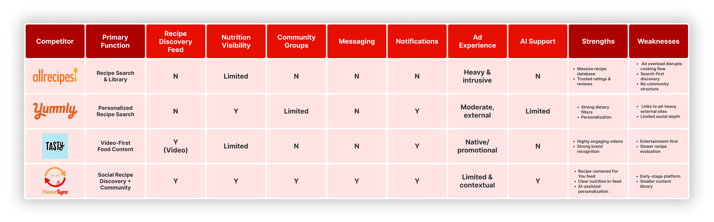
Key Findings
Each platform offers valuable pieces of the cooking journey such as large recipe libraries, personalization, or highly engaging food content, yet all introduce friction through ad-heavy interfaces, inefficient discovery patterns, or entertainment-first formats that slow real decision-making. None combine a recipe-centered discovery feed, meaningful community spaces, and AI-supported personalization in a way that feels seamless and respectful of users’ attention. These gaps in clarity, connection, and usability directly shaped FlavorSync’s direction as a more thoughtful, social cooking experience built to support confidence in the kitchen.
EMPATHIZE
Interview Results
Home cooks want recipe experiences that respect their time, attention, and decision-making process. When essential information is hidden behind ads, excessive scrolling, or poor structure, confidence breaks down and cooking becomes unnecessarily stressful.
This insight directly informed FlavorSync’s emphasis on:
Clean, low-friction recipe layouts
Early visibility of nutrition information
Structured, step-by-step instructions with clear measurements
A calmer, more supportive cooking experience overall
Primary Persona
Based on patterns from my user interviews and competitive insights, I created a single primary persona that reflects the core traveler American Odyssey is designed to support. While people plan trips in different ways, the most consistent needs came from travelers who feel overwhelmed by scattered information and want a simpler, more curated approach to planning U.S. trips. Because American Odyssey aims to make travel planning clearer, more enjoyable, and less fragmented, this persona became the central focus for shaping the product’s features and experience.
Determining the User Flow
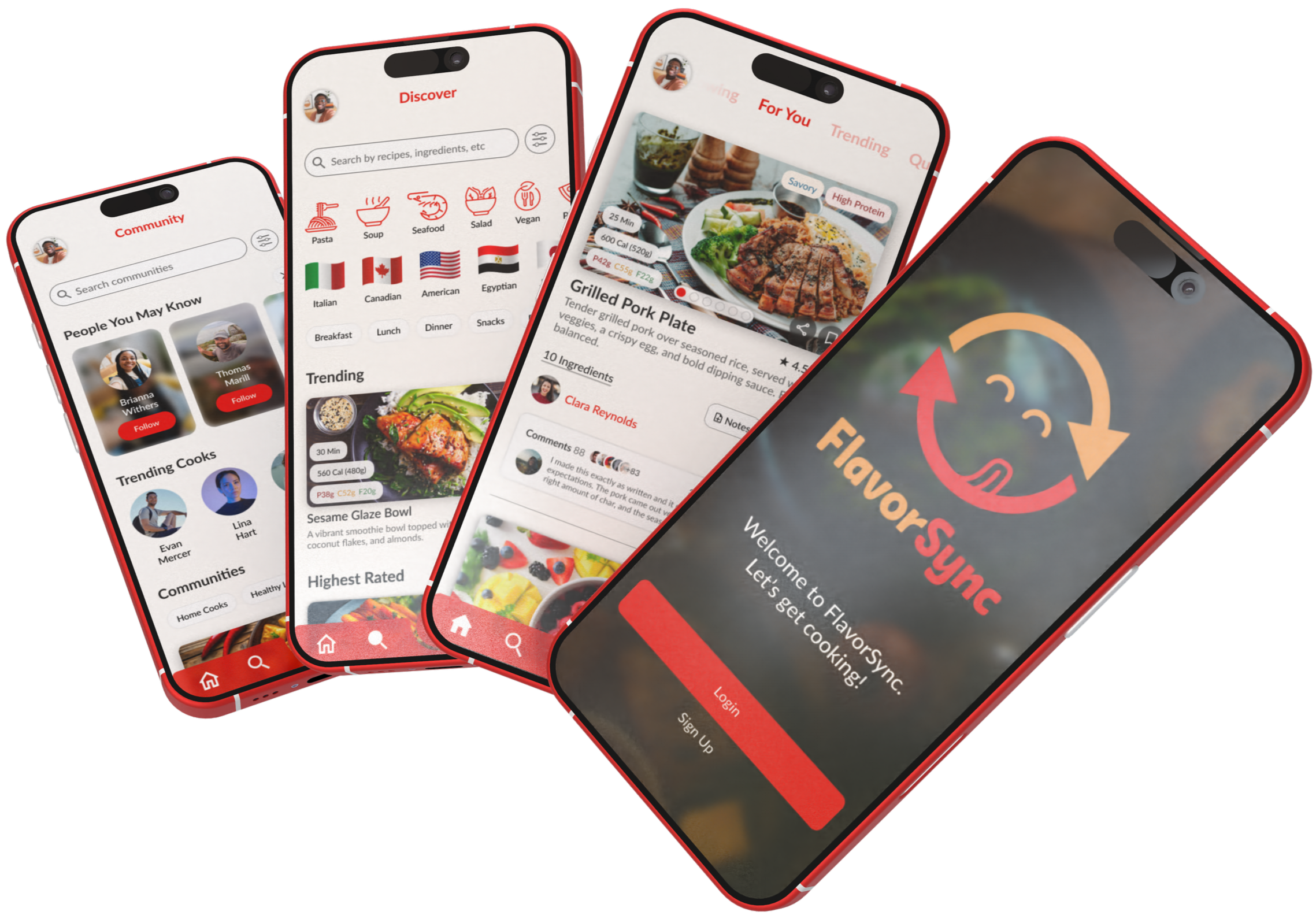
After reviewing the research and identifying where users were getting slowed down, I focused on creating an information architecture that removed friction and made the experience easier to navigate. The user flow centers around a recipe-first “For You” feed, allowing users to discover, evaluate, and move forward quickly without unnecessary steps. This structure set the foundation for a faster, more intuitive cooking experience.
User Interviews
To better understand real cooking behaviors and frustrations, I conducted in-person interviews with five individuals, taking notes directly on my device during each session. Participants represented a range of cooking habits, but all regularly used digital recipes when deciding what to cook.
Rather than testing solutions, these interviews focused on uncovering pain points in existing recipe experiences and understanding what information users prioritize while cooking.
Frustration with ad-heavy recipe pages
Three participants expressed annoyance with the number of ads and pop-ups present on recipe websites. Many described having to scroll excessively just to reach the actual recipe, which disrupted their focus and made cooking feel more frustrating than enjoyable.
Difficulty accessing critical information quickly
Users noted that long introductions and cluttered layouts slowed them down, especially when cooking in real time. The need to hunt for ingredients or steps created unnecessary friction during a task that requires attention and timing.
Strong emphasis on nutrition visibility
Several participants emphasized that being able to quickly view macro nutrients such as calories, protein, carbs, and fats was extremely important when deciding whether to cook a recipe. When this information was hidden or missing, it reduced confidence and increased hesitation.
Lack of ingredient measurements within steps
A recurring frustration was the separation between ingredient lists and step-by-step instructions. Users expressed a preference for seeing specific ingredient measurements embedded directly within each step, reducing the need to scroll back and forth while cooking.
DESIGN
Brand Identity
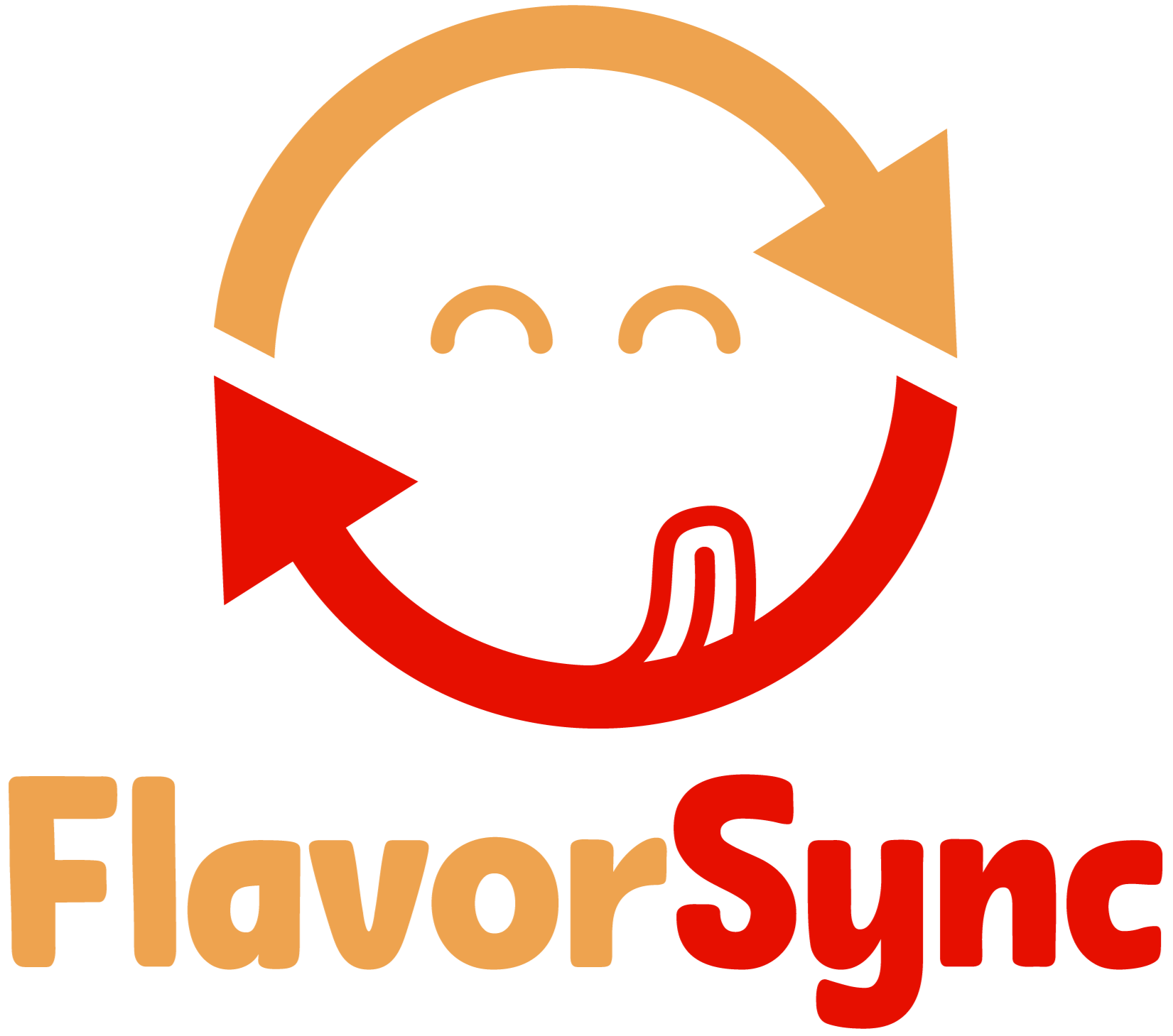
I explored visual directions that could communicate simplicity, enjoyment, and connection around food. Early concepts leaned into literal food icons and utensils, but they felt generic and didn’t reflect what makes the platform different. The direction clicked when I reframed the brand around the idea of syncing people with recipes they actually want, without friction or noise.
The final mark is inspired by the universal sync icon, reimagined with personality. The circular arrows represent alignment, flow, and discovery, while the integrated face adds warmth and approachability. The slurping tongue reinforces FlavorSync’s focus on taste and satisfaction, bringing a playful, food-forward moment into an otherwise functional symbol. Together, the icon balances utility and delight, capturing the brand’s goal of making recipe discovery feel effortless, enjoyable, and human.
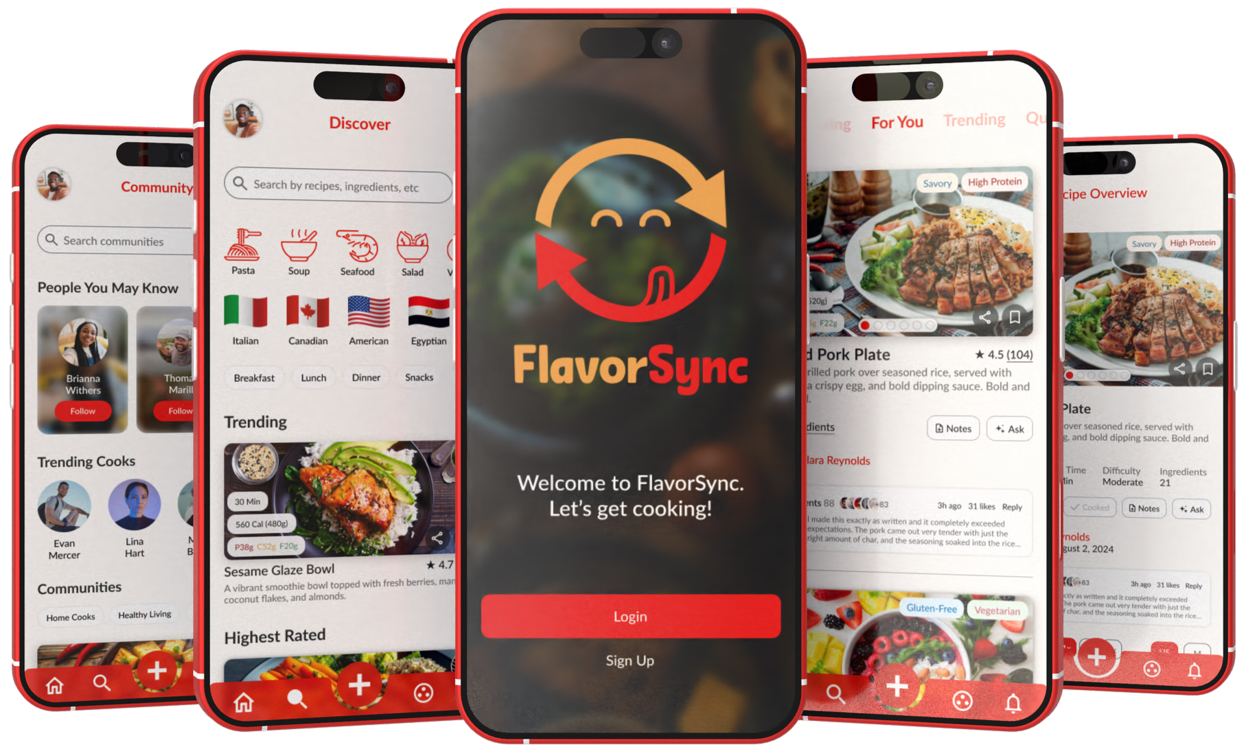
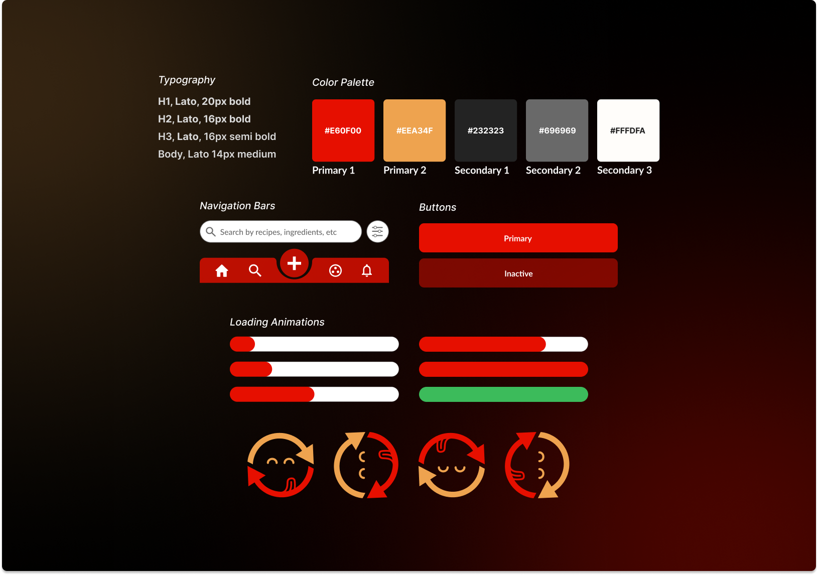
UI Component Library
To support FlavorSync’s brand identity, I designed a cohesive UI component library that translates the playful, food-forward personality into a scalable and consistent system. The goal was to create an interface that feels energetic and approachable while staying highly functional, allowing users to move quickly from discovery to cooking without distraction.
The system is grounded in a warm, appetite-driven color palette. Bold reds serve as primary action colors, reinforcing moments of intent such as saving, posting, or adding recipes, while softer orange tones add warmth and balance. Neutral grays and off-white backgrounds provide contrast and restraint, ensuring that recipe imagery and content remain the focal point.
Rounded corners are used consistently across buttons, cards, inputs, and navigation elements to soften the interface and create a warm, inviting atmosphere. This subtle curvature makes interactions feel more approachable and friendly, reinforcing FlavorSync’s emphasis on comfort and enjoyment rather than rigidity or complexity.
Typography plays a key role in maintaining clarity. Lato was chosen for its friendly tone and strong readability across headers, navigation, and dense recipe content. Clear hierarchy and consistent sizing allow users to scan ingredients, macros, and instructions effortlessly.
A Quick Recap
Research showed that online recipe discovery often feels cluttered and frustrating for users. People bounce between ad-heavy food blogs, noisy social media posts, saved screenshots, and note apps just to find and follow a single recipe, which disrupts cooking flow and increases cognitive load. Many users expressed frustration with excessive scrolling, intrusive ads, and long narratives that bury the actual instructions.
Interviewees also noted that while social platforms provide inspirational content, they lack structure, follow-up, and trust. Recipes are hard to revisit, discussions are scattered, and there is little support for asking questions or learning from others. Overall, cooks wanted a cleaner, recipe-first experience with fewer distractions, clearer guidance, and a dedicated space to connect with like-minded people without the noise.
How Flavorsync Fixes These Problems
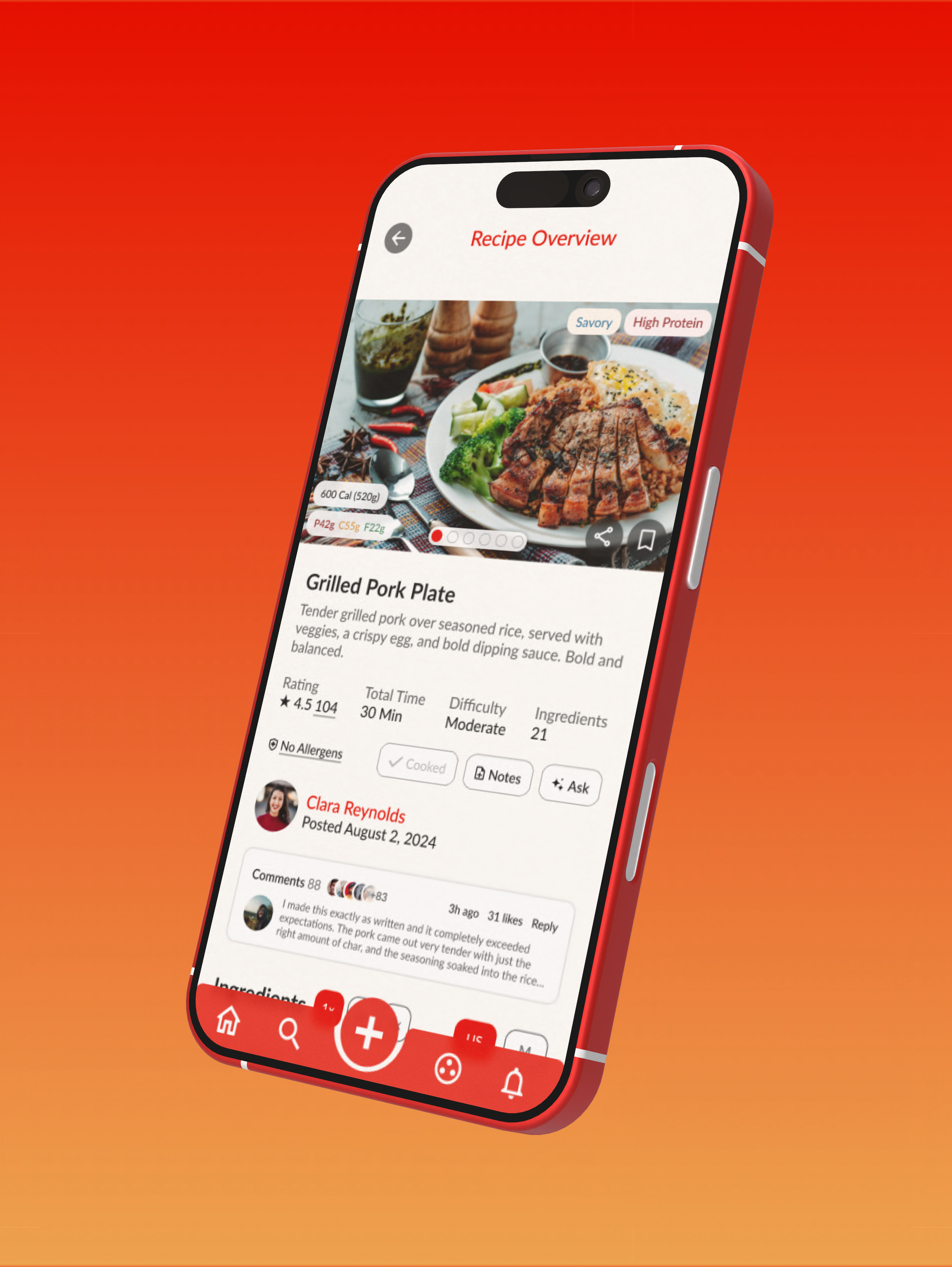
FlavorSync addresses these issues by intentionally stripping away friction and refocusing the experience on what matters most: cooking. Recipes are presented in a clean, mobile-first “For You” feed that prioritizes clarity over clutter, allowing users to quickly scan ingredients, macros, and steps without interruptive ads or unnecessary content. This keeps users in a focused, efficient flow from discovery to execution.
Instead of borrowing noisy social patterns, FlavorSync uses purposeful community features. Dedicated groups give users a place to discuss recipes, share tips, ask questions, and learn from others with shared interests. Conversations live alongside the content they reference, making interaction useful rather than distracting.
By unifying recipe discovery, community, and communication into a cohesive experience, FlavorSync eliminates the need to juggle multiple platforms. The result is a calmer, more trustworthy cooking environment that supports real-world use and fosters genuine connection between cooks.
TESTING
Usability Testing
To test my high fidelity prototype’s core features, I conducted a round of usability testing using 5 participants. This round of testing was conducted in person and notes were taken to review afterwards.
Test Findings
Key Wins
Users consistently praised the clear, transparent macro breakdown displayed directly on each recipe card, making it easier to evaluate recipes at a glance.
Participants found the ingredient count preview on recipe cards especially helpful for quickly assessing complexity and prep effort before opening a recipe.
The ability to search for recipes by ingredients was highlighted as one of the most useful features, helping users reduce waste and cook with what they already have.
Users appreciated the visibility of community events, noting that it made the social aspect of the app feel active, relevant, and easy to engage with.
Pain Points
Users expressed a need for greater feed customization, wanting more control over the types of recipes and content shown in their feed.
Several participants noted the importance of capturing nutrition preferences and dietary needs during onboarding, such as macro goals, allergies, or lifestyle choices, to ensure recommendations feel more relevant from the start.
Testing Takeaways
This round of testing was incredibly helpful. The feedback gave real insight into how people actually used the app, and many of their suggestions were carried straight into the final prototype. The result is a design that feels more intuitive, more refined, and more grounded in real user needs.
REFLECTION
What’s Next?
The next step for FlavorSync is to build on insights from usability testing by introducing deeper personalization and smarter onboarding, creating a more tailored cooking experience that adapts to individual tastes, nutrition goals, and behaviors over time. These refinements will help position FlavorSync as a trusted, everyday companion for discovering, cooking, and connecting through food.
Key takeaways
There’s a lot to consider when designing a product in an already crowded space. What problems are truly worth solving? What features genuinely improve the user’s experience? How do you balance clarity, functionality, and personality? These questions guided every decision I made while creating FlavorSync. The process pushed me to think more intentionally about usability, structure, and human connection, strengthening how I approach designing thoughtful, user-centered experiences.
Here are my 3 key takeaways from this project:
Interviews are essential. Especially when designing a social-first product, direct conversations with users shape everything. Hearing how people discover recipes, interact with others, and express their frustrations ensured that every decision stayed grounded in real behavior rather than assumptions.
Design around real interaction, not features. In a social app, success is defined by how users engage with each other, not by how many tools are added. Prioritizing meaningful interaction helped keep the experience focused, intentional, and aligned with user needs.
Clarity creates trust. When users can quickly understand content, see nutritional information, and navigate without confusion, they feel more confident using the product. Designing with clarity in mind reinforced the importance of simplicity as a foundation for trust and long-term engagement.
FlavorSync pushed me to think beyond individual recipes and focus on the full experience of cooking and connection. It strengthened my approach to usability, reinforced the value of thoughtful structure, and reminded me why I enjoy designing products that support real, everyday moments in people’s lives.
Thank you for viewing my work. Shown below are a few of my other projects.
UI/UX CASE STUDIES
Each case study breaks down the problem, research, design decisions, and outcomes behind the final product.